7 mistakes to avoid when styling bookshelves
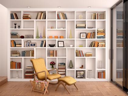
Styling a bookshelf requires a little more effort than simply throwing knickknacks and hardbacks in one place and hoping for the best. It can take time to find the right balance and avoid an overly decorated display. Once you find the right mix of elements, the result should allow your most treasured items to shine. While books can certainly be the focus of your shelves, think outside the box, too. You can never go wrong with decorating shelves with items that show off your personality, but there are a few styling mistakes that are worth avoiding. Here are the bookcase styling pitfalls to avoid.
1. Only using books
It might sound intuitive to keep your bookshelves strictly business — and by business, we mean books — but decorative items, photos, and collections are often the key to put-together shelf styling. Incorporating other objects on your shelves not only gives them more personality but also creates a more well-rounded display. A small vase of flowers, a battery-operated lamp, special mementos, and framed art can all come into play.
2. Mixing too many materials
To keep your bookshelves from feeling chaotic, think about materials and how you can keep a sense of cohesion. Mixing rustic elements like worn books with a pretty blown-glass vase can create the perfect juxtaposition, but mixing brass, wood, glass, leather, and ceramic all on one tiny shelf can lend a busy feeling that doesn’t look quite right. If you’re working with a wall of shelves, consider spreading the items out for a more cohesive display.
3. Getting the scale wrong
Size matters when it comes to styling items. Whether something seems dwarfed among the shelves or takes a great deal of maneuvering just to make it fit, an item that isn’t quite the right size will stick out like a sore thumb. While it’s best to have items of varying sizes, finding the right balance is key. To give smaller items more weight, group them together. As for large items, give them plenty of breathing room in order to keep the display from feeling too crowded.
4. Keeping it one-dimensional
Don’t let your shelves fall flat. The key to adding depth and interest to your display is layering. This can mean leaning a small framed print in front of a row of books or showing off a collection of candlesticks of varying sizes in front of a small mirror that’s held upright on a display stand. Get creative and play with your items until you find the right look. Consider creating a stadium-like effect with taller items in the back and smaller items in the front, rather than having them all mixed together or spread throughout the display area.
5. Not considering the back of the bookshelves
While the emphasis is certainly what’s on the shelves, what’s behind them matters too. Wallpaper, shiplap, or a splash of paint can all add personality behind your book and decor collections. Good lighting can also help draw out these details that might otherwise go unnoticed. Illuminate your shelves with library lights, small lamps, and even candles (go for battery-operated if it’s tight quarters) to show off back-of-shelf details.
6. Arranging items too close together
One thing that’s highly important to keep in mind when working with open shelves is the fine line between perfectly appointed and chaotic. A quick way to ensure your shelves skew more toward the former is by allowing items and collections to have their own moment. Creating space or breathing room throughout your shelves allows your display to feel more harmonious and ensures each item or grouping gets its own due. When your shelves become too crowded, that’s when you won’t be able to appreciate those special items you’re aiming to display.
7. Over-styling your shelves
In a world of #shelfies, stand apart from the crowd. Your books can take center stage even if they’re not perfectly color-coded. Creating bookshelves that look perfectly styled takes restraint and a good eye, so give it time. Start with items that you love and want to take center stage to help you keep the focus. From there, add in additional items, little by little. If something doesn’t feel quite right, take it out. Use your shelves as a space for collecting your most treasured items, and never forget to be on the lookout for new-to-you pieces to add to the display.
(Better Homes and Gardens is a magazine and website devoted to ideas and improvement projects for your home and garden, plus recipes and entertaining ideas. Online at www.bhg.com.)
©2024 Dotdash Meredith. All rights reserved. Used with permission. Distributed by Tribune Content Agency, LLC.






















Comments